R တွင် correlation heatmap တစ်ခုဖန်တီးနည်း (ဥပမာနှင့်အတူ)
R တွင် ဆက်စပ်အပူမြေပုံတစ်ခုဖန်တီးရန် အောက်ပါအခြေခံအထားအသိုကိုသုံးနိုင်သည်။
 #calculate correlation between each pairwise combination of variables
cor_df <- round(cor(df), 2)

#melt the data frame
melted_cormat <- melt(cor_df)

#create correlation heatmap
ggplot(data = melted_cormat, aes(x=Var1, y=Var2, fill=value)) +
  geom_tile() +
  geom_text(aes(Var2, Var1, label = value), size = 5 ) +
  scale_fill_gradient2(low = " blue ", high = " red ",
                       limit = c(-1,1), name=" Correlation ") +
  theme(axis. title . x = element_blank(),
        axis. title . y = element_blank(),
        panel. background = element_blank())
အောက်ဖော်ပြပါ ဥပမာသည် ဤ syntax ကို လက်တွေ့တွင် မည်သို့အသုံးပြုရမည်ကို ပြသထားသည်။
ဥပမာ- R တွင် ဆက်စပ်မှု အပူမြေပုံတစ်ခု ဖန်တီးပါ။
မတူညီသော ဘတ်စကက်ဘောကစားသမား ရှစ်ဦးအတွက် အမျိုးမျိုးသော ကိန်းဂဏန်းအချက်အလက်များကို ပြသသည့် R တွင် အောက်ပါဒေတာဘောင်ရှိသည်ဆိုပါစို့။
 #create data frame
df <- data. frame (points=c(22, 25, 30, 16, 14, 18, 29, 22),
                 assists=c(4, 4, 5, 7, 8, 6, 7, 12),
                 rebounds=c(10, 7, 7, 6, 8, 5, 4, 3),
                 blocks=c(12, 4, 4, 6, 5, 3, 8, 5))

#view data frame
df

  points assists rebounds blocks
1 22 4 10 12
2 25 4 7 4
3 30 5 7 4
4 16 7 6 6
5 14 8 8 5
6 18 6 5 3
7 29 7 4 8
8 22 12 3 5
ဒေတာဘောင်ရှိ ကိန်းရှင်များ၏ အတွဲလိုက်ပေါင်းစပ်မှုတစ်ခုစီကြားရှိ ဆက်စပ်ကိန်းများကို မြင်ယောင်နိုင်ရန် ဆက်စပ်အပူမြေပုံတစ်ခု ဖန်တီးလိုသည်ဆိုပါစို့။
ဆက်စပ်အပူမြေပုံကို မဖန်တီးမီ၊ ကျွန်ုပ်တို့သည် cor() ကို အသုံးပြု၍ ကိန်းရှင်တစ်ခုစီကြားရှိ ဆက်စပ်ကိန်းကို ဦးစွာတွက်ချက်ရန် လိုအပ်ပြီး ရလဒ်များကို package’s melt() function reshape2 ကို အသုံးပြု၍ အသုံးပြုနိုင်သော ဖော်မတ်အဖြစ်သို့ ပြောင်းလဲရန် လိုအပ်ပါသည်။
 library (reshape2)

#calculate correlation coefficients, rounded to 2 decimal places
cor_df <- round(cor(df), 2)

#melt the data frame
melted_cor <- melt(cor_df)

#view head of melted data frame
head(melted_cor)

      Var1 Var2 value
1 points points 1.00
2 assist points -0.27
3 rebound points -0.16
4 block points 0.10
5 assist points -0.27
6 assists assists 1.00
နောက်တစ်ခု၊ ဆက်စပ်အပူမြေပုံတစ်ခုဖန်တီးရန် ggplot2 အထုပ်မှ geom_tile() လုပ်ဆောင်ချက်ကို အသုံးပြုနိုင်သည်။
 library (ggplot2)

#create correlation heatmap
ggplot(data = melted_cor, aes(x=Var1, y=Var2, fill=value)) +
  geom_tile() +
  geom_text(aes(Var2, Var1, label = value), size = 5 ) +
  scale_fill_gradient2(low = " blue ", high = " red ",
                       limit = c(-1,1), name=" Correlation ") +
  theme(axis. title . x = element_blank(),
        axis. title . y = element_blank(),
        panel. background = element_blank())
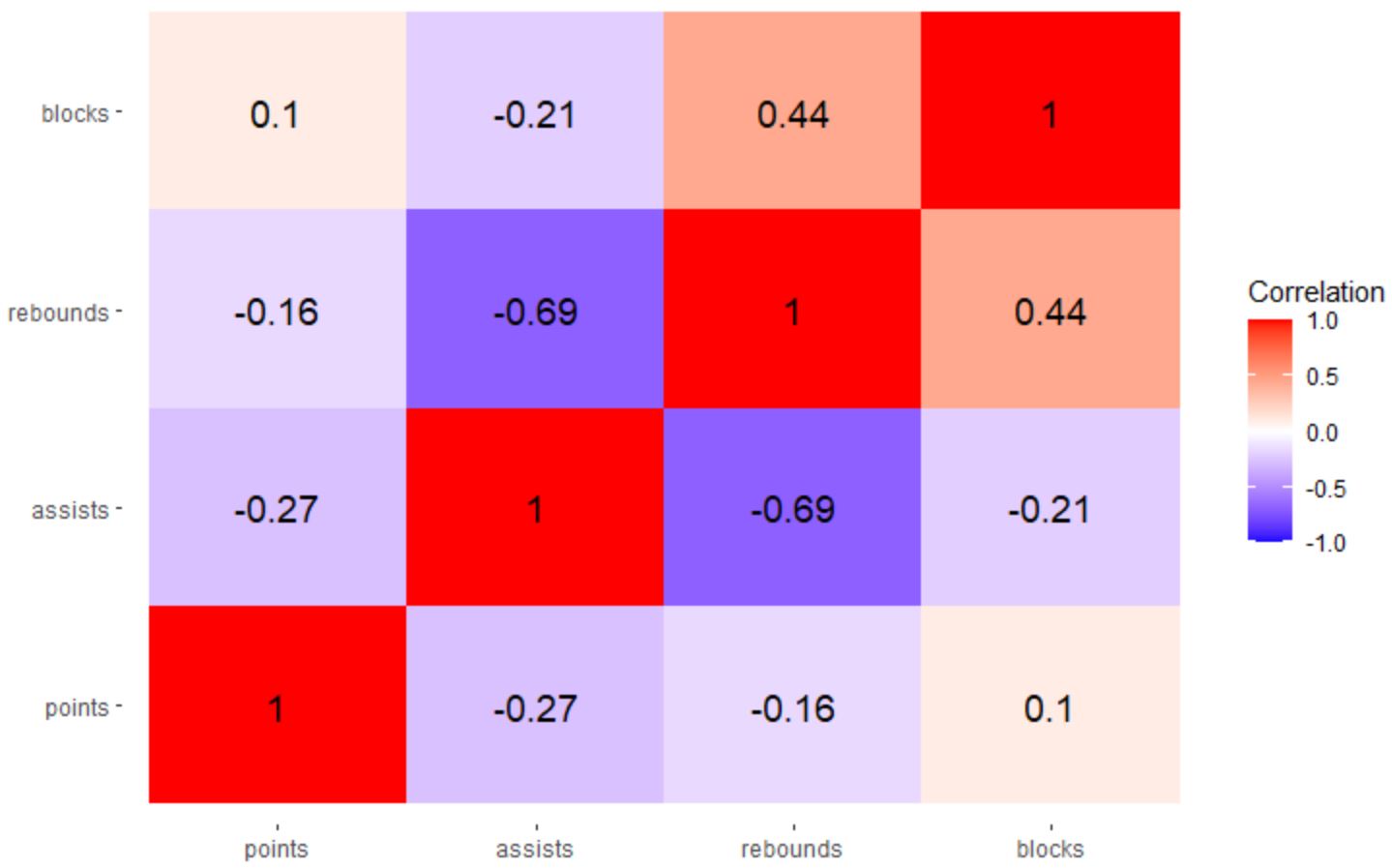
ရလဒ်မှာ ကိန်းရှင်များအတွဲလိုက် ပေါင်းစပ်မှုတစ်ခုစီကြားရှိ ဆက်စပ်ကိန်းကို မြင်ယောင်နိုင်စေမည့် ဆက်စပ်အပူမြေပုံတစ်ခုဖြစ်သည်။
ဤအထူးသဖြင့် အပူမြေပုံတွင်၊ ဆက်စပ်ကိန်းများကို အောက်ပါအရောင်များပေါ်တွင် ယူသည်-
- အပြာရောင် ပိတ်လျှင် -၁
- အဖြူတွေ ပိတ်ရင် ၀ တ် တယ်။
- အနီရောင် ၁
scale_fill_gradient2() လုပ်ဆောင်ချက်ရှိ အ နိမ့် နှင့် မြင့်သော အကြောင်းပြချက်များအတွက် သင်အလိုရှိသော မည်သည့်အရောင်မဆို လွတ်လပ်စွာ အသုံးပြုပါ။
ဥပမာအားဖြင့်၊ တန်ဖိုးနိမ့်အတွက် “ အနီရောင်” နှင့် “ အစိမ်းရောင်” ကို မြင့်မားသောတန်ဖိုးအတွက် သင်အသုံးပြုနိုင်သည်-
 library (ggplot2)

#create correlation heatmap
ggplot(data = melted_cor, aes(x=Var1, y=Var2, fill=value)) +
  geom_tile() +
  geom_text(aes(Var2, Var1, label = value), size = 5 ) +
  scale_fill_gradient2(low = " red ", high = " green ",
                       limit = c(-1,1), name=" Correlation ") +
  theme(axis. title . x = element_blank(),
        axis. title . y = element_blank(),
        panel. background = element_blank())
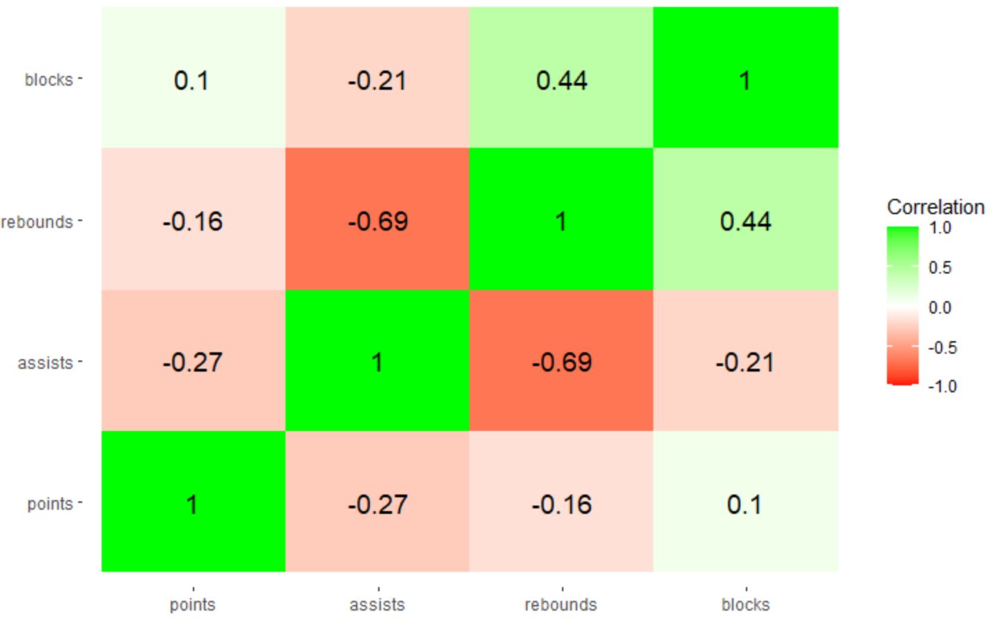
မှတ်ချက် – ဆက်စပ်အပူမြေပုံရှိ အတိအကျအရောင်များကို ပို၍ထိန်းချုပ်လိုပါက အသုံးပြုရန် ဆဋ္ဌမဂဏန်းအရောင်ကုဒ်များကို သတ်မှတ်နိုင်သည်။
ထပ်လောင်းအရင်းအမြစ်များ
အောက်ဖော်ပြပါ သင်ခန်းစာများသည် ggplot2 တွင် အခြားဘုံအလုပ်များကို မည်သို့လုပ်ဆောင်ရမည်ကို ရှင်းပြသည်-
ggplot2 တွင် ဝင်ရိုးတံဆိပ်များကို လှည့်နည်း
ggplot2 တွင် ဝင်ရိုးကွဲများကို သတ်မှတ်နည်း
ggplot2 တွင် ဝင်ရိုးကန့်သတ်ချက်များကို မည်သို့သတ်မှတ်မည်နည်း။
ggplot2 တွင် ဒဏ္ဍာရီအညွှန်းများကို မည်သို့ပြောင်းရမည်နည်း။
စာရေးသူအကြောင်း
Benjamin Anderson
မင်္ဂလာပါ၊ ကျွန်ုပ်သည် အငြိမ်းစား စာရင်းအင်း ပါမောက္ခ ဘင်ဂျမင်ဖြစ်ပြီး သီးသန့် Statorials ဆရာအဖြစ် လှည့်ပတ်ပါသည်။ စာရင်းဇယားနယ်ပယ်တွင် ကျယ်ပြန့်သောအတွေ့အကြုံနှင့် ကျွမ်းကျင်မှုနှင့်အတူ၊ Statorials မှတစ်ဆင့် ကျောင်းသားများကို ခွန်အားဖြစ်စေရန်အတွက် ကျွန်ုပ်၏အသိပညာကို မျှဝေလိုပါသည်။ ပိုသိတယ်။