R တွင် အသင့်တော်ဆုံး မျဉ်းဆွဲနည်း (ဥပမာများဖြင့်)
R တွင် အသင့်တော်ဆုံးမျဉ်းဆွဲရန် အောက်ပါနည်းလမ်းများကို သင်အသုံးပြုနိုင်ပါသည်။
နည်းလမ်း 1- R အခြေခံတွင် အသင့်တော်ဆုံးမျဉ်းကို ဆွဲပါ။
 #create scatter plot of x vs. y
plot(x, y)

#add line of best fit to scatter plot
abline(lm(y ~ x))
နည်းလမ်း 2- ggplot2 တွင် အသင့်တော်ဆုံး လိုင်းကိုဆွဲပါ။
 library (ggplot2)

#create scatter plot with line of best fit
ggplot(df, aes (x=x, y=y)) +
    geom_point() +
    geom_smooth(method=lm, se= FALSE )
အောက်ဖော်ပြပါ ဥပမာများသည် နည်းလမ်းတစ်ခုစီကို လက်တွေ့အသုံးချနည်းကို ပြသထားသည်။
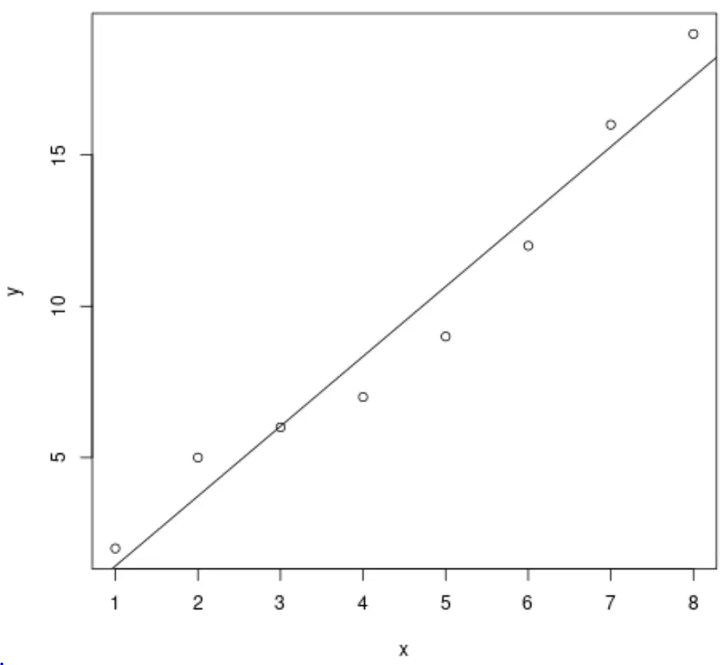
ဥပမာ 1- R base တွင် အသင့်တော်ဆုံးမျဉ်းကိုဆွဲပါ။
အောက်ဖော်ပြပါကုဒ်သည် R အခြေခံကို အသုံးပြု၍ ရိုးရှင်းသောမျဉ်းကြောင်းဆုတ်ယုတ်မှုပုံစံအတွက် အသင့်တော်ဆုံးမျဉ်းတစ်ကြောင်းကို မည်သို့ဆွဲရမည်ကို ပြသသည်-
 #define data
x <- c(1, 2, 3, 4, 5, 6, 7, 8)
y <- c(2, 5, 6, 7, 9, 12, 16, 19)

#create scatter plot of x vs. y
plot(x, y)

#add line of best fit to scatter plot
abline(lm(y ~ x))
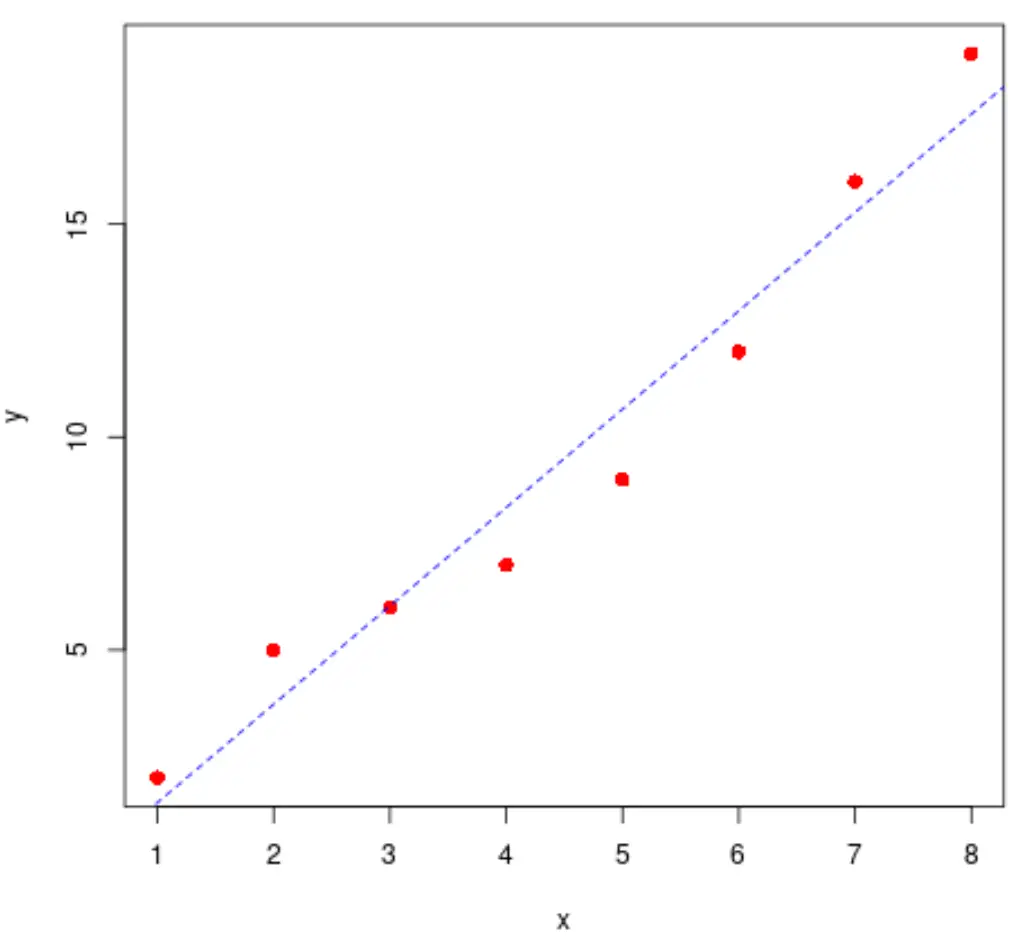
အမှတ်များနှင့်မျဉ်း၏ပုံစံကိုလည်းမွမ်းမံရန် တုံ့ဆိုင်းမနေပါနှင့်။
 #define data
x <- c(1, 2, 3, 4, 5, 6, 7, 8)
y <- c(2, 5, 6, 7, 9, 12, 16, 19)

#create scatter plot of x vs. y
plot(x, y, pch= 16 , col=' red ', cex= 1.2 )

#add line of best fit to scatter plot
abline(lm(y ~ x), col=' blue ', lty=' dashed ')
အကောင်းဆုံးကိုက်ညီမှုမျဉ်းကို အမြန်တွက်ချက်ရန် အောက်ပါကုဒ်ကိုလည်း အသုံးပြုနိုင်ပါသည်။
 #find regression model coefficients
summary(lm(y ~ x))$coefficients

              Estimate Std. Error t value Pr(>|t|)
(Intercept) -0.8928571 1.0047365 -0.888648 4.084029e-01
x 2.3095238 0.1989675 11.607544 2.461303e-05
အသင့်တော်ဆုံးမျဉ်းသည် y = -0.89 + 2.31x ဖြစ်သည် ။
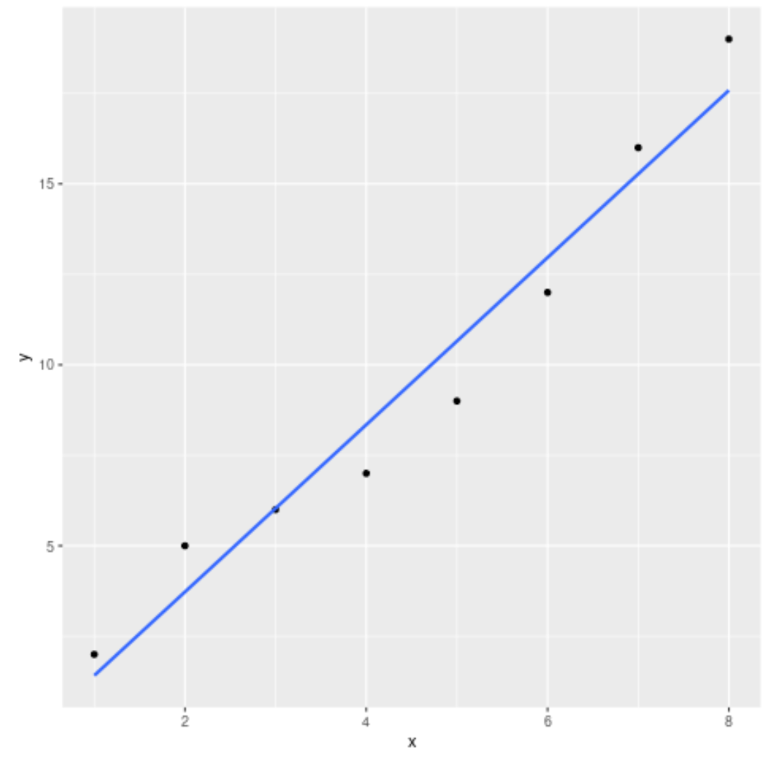
ဥပမာ 2- ggplot2 တွင် အကောင်းဆုံး-အံဝင်ခွင်ကျမျဉ်းကို ရေးဆွဲခြင်း။
အောက်ပါကုဒ်သည် ggplot2 data visualization package ကို အသုံးပြု၍ ရိုးရှင်းသော linear regression model အတွက် အကောင်းဆုံး-အံဝင်ခွင်ကျ မျဉ်းကြောင်းကို မည်သို့ဆွဲရမည်ကို ပြသသည်-
 library (ggplot2)

#define data
df <- data. frame (x=c(1, 2, 3, 4, 5, 6, 7, 8),
y=c(2, 5, 6, 7, 9, 12, 16, 19))

#create scatter plot with line of best fit
ggplot(df, aes (x=x, y=y)) +
    geom_point() +
    geom_smooth(method=lm, se= FALSE )
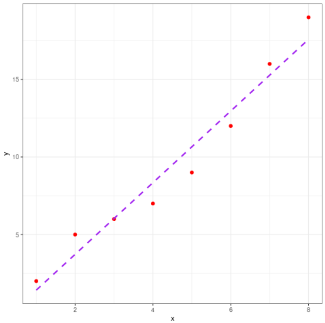
ဇာတ်ကွက်၏ အလှတရားကိုလည်း လွတ်လပ်စွာ ပြောင်းလဲနိုင်သည်-
 library (ggplot2)

#define data
df <- data. frame (x=c(1, 2, 3, 4, 5, 6, 7, 8),
y=c(2, 5, 6, 7, 9, 12, 16, 19))

#create scatter plot with line of best fit
ggplot(df, aes (x=x, y=y)) +
    geom_point(col=' red ', size= 2 ) +
    geom_smooth(method=lm, se= FALSE , col=' purple ', linetype=' dashed ') +
    theme_bw()
ထပ်လောင်းအရင်းအမြစ်များ
အောက်ဖော်ပြပါ သင်ခန်းစာများသည် R တွင် အခြားသော ဘုံလုပ်ဆောင်ချက်များကို မည်သို့လုပ်ဆောင်ရမည်ကို ရှင်းပြသည်-
R တွင် ရိုးရှင်းသော linear regression လုပ်နည်း
R တွင် linear regression အများအပြားလုပ်ဆောင်နည်း
R တွင် regression output ကို အဓိပ္ပာယ်ဖွင့်ဆိုပုံ
စာရေးသူအကြောင်း
Benjamin Anderson
မင်္ဂလာပါ၊ ကျွန်ုပ်သည် အငြိမ်းစား စာရင်းအင်း ပါမောက္ခ ဘင်ဂျမင်ဖြစ်ပြီး သီးသန့် Statorials ဆရာအဖြစ် လှည့်ပတ်ပါသည်။ စာရင်းဇယားနယ်ပယ်တွင် ကျယ်ပြန့်သောအတွေ့အကြုံနှင့် ကျွမ်းကျင်မှုနှင့်အတူ၊ Statorials မှတစ်ဆင့် ကျောင်းသားများကို ခွန်အားဖြစ်စေရန်အတွက် ကျွန်ုပ်၏အသိပညာကို မျှဝေလိုပါသည်။ ပိုသိတယ်။