Ggplot2 တွင် ကွက်ကွက်နှင့် ဒဏ္ဍာရီသို့ အလျားလိုက်မျဉ်းကို ထည့်နည်း
ggplot2 တွင် ကွက်ကွက်တစ်ခုသို့ အလျားလိုက်မျဉ်းတစ်ခုကို ထည့်ရန် အောက်ပါ syntax ကို သုံးနိုင်ပြီး၊ ထို့နောက် ဒဏ္ဍာရီတွင် အလျားလိုက်မျဉ်းကို အစိတ်အပိုင်းတစ်ခုအဖြစ် ထည့်နိုင်သည်။
 library (ggplot2)

#create data frame with values to plot
df <- data. frame (team=rep(c(' A ', ' B '), each= 5 ),
                 assists=c(1, 3, 3, 4, 5, 7, 7, 9, 9, 10),
                 points=c(4, 8, 12, 10, 18, 25, 20, 28, 33, 35))

#create data frame that contains horizontal line location
cutoff <- data. frame (yintercept= 22 , Lines=' Cutoff ')

#create scatterplot with horizontal line and include horizontal line in legend
ggplot(df, aes(x=assists, y=points)) +
  geom_point(aes(color=team)) +
  geom_hline(aes(yintercept=yintercept, linetype=Lines), cutoff)
အလျားလိုက်မျဉ်း၏ y-ကြားဖြတ်တန်ဖိုးသာ ပါဝင်သော သီးခြားဒေတာဘောင်တစ်ခုကို ဖန်တီးခြင်းဖြင့်၊ ကျွန်ုပ်တို့သည် အလျားလိုက်မျဉ်းကို ဇာတ်ကွက်ထဲသို့ ထည့်နိုင်ပြီး ၎င်းကို ဒဏ္ဍာရီတွင် အလိုအလျောက်ထည့်နိုင်သည်။
အောက်ဖော်ပြပါ ဥပမာသည် ဤ syntax ကို လက်တွေ့တွင် မည်သို့အသုံးပြုရမည်ကို ပြသထားသည်။
ဥပမာ- ggplot2 တွင် ကွက်ကွက်နှင့် ဒဏ္ဍာရီသို့ အလျားလိုက်မျဉ်းကို ထည့်ပါ။
အသင်းအမျိုးမျိုးမှ ဘတ်စကက်ဘောကစားသမားများအကြောင်း အချက်အလက်ပါရှိသော R တွင် အောက်ပါဒေတာဘောင်ရှိသည်ဆိုပါစို့။
 #create data frame
df <- data. frame (team=rep(c(' A ', ' B '), each= 5 ),
                 assists=c(1, 3, 3, 4, 5, 7, 7, 9, 9, 10),
                 points=c(4, 8, 12, 10, 18, 25, 20, 28, 33, 35))

#view data frame
df

   team assists points
1 To 1 4
2 to 3 8
3 to 3 12
4 to 4 10
5 to 5 18
6 B 7 25
7 B 7 20
8 B 9 28
9 B 9 33
10 B 10 35
ကစားသမားတစ်ဦးစီအတွက် အမှတ်နှင့် အထောက်အကူတန်ဖိုးများကို မြင်သာစေရန် ggplot2 တွင် ကျွန်ုပ်တို့သည် ၎င်းတို့၏အဖွဲ့ကိုအခြေခံ၍ အလျားလိုက်မျဉ်းတစ်ခုကို y = 22 တွင်ထည့်ကာ အကောင်းနှင့်အဆိုးအကြားခြားနားချက်အတွက် “ threshold” ကိုသတ်မှတ်ရန်၊ ကစားသမားများ။
ဒါကိုလုပ်ဖို့ အောက်ပါ syntax ကို သုံးနိုင်ပါတယ်။
 library (ggplot2)

#create data frame that contains horizontal line location
cutoff <- data. frame (yintercept= 22 , Lines=' Cutoff ')

#create scatterplot with horizontal line and include horizontal line in legend
ggplot(df, aes(x=assists, y=points)) +
  geom_point(aes(color=team)) +
  geom_hline(aes(yintercept=yintercept, linetype=Lines), cutoff)
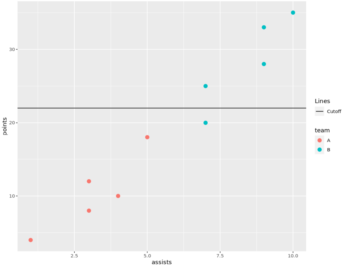
ဇာတ်ကွက်၏ ညာဘက်ရှိ ဒဏ္ဍာရီတွင် မည်သည့်အသင်းများနှင့် အလျားလိုက်မျဉ်းကြောင်းကို ဖြတ်တောက်ထားသောမျဉ်းကိုကိုယ်စားပြုရန် ဒဏ္ဍာရီတွင် မည်သည့်အသင်းများနှင့် အလျားလိုက်မျဉ်းကြောင်းကို ညွှန်ပြသည့် စက်ဝိုင်းများပါရှိသည်ကို သတိပြုပါ။
ဒဏ္ဍာရီတွင် အလျားလိုက်မျဉ်းစာတန်းကို ပြောင်းလိုပါက Break Data Frame ရှိ Rows ကော်လံရှိ စာသားကို တည်းဖြတ်ပါ။
ဥပမာအားဖြင့်၊ အလျားလိုက်မျဉ်း၏ အညွှန်းကို “ Good versus Evil Threshold” သို့ ပြောင်းရန် အောက်ပါ syntax ကို အသုံးပြုနိုင်ပါသည်။
 library (ggplot2)

#create data frame that contains horizontal line location
cutoff <- data. frame (yintercept= 22 , Lines=' Cutoff of Good vs. Bad ')

#create scatterplot with horizontal line and include horizontal line in legend
ggplot(df, aes(x=assists, y=points)) +
  geom_point(aes(color=team)) +
  geom_hline(aes(yintercept=yintercept, linetype=Lines), cutoff)
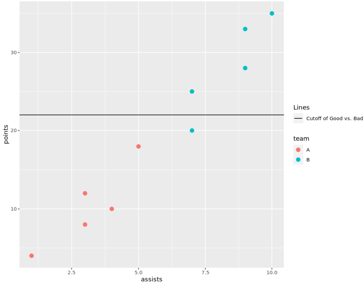
ဒဏ္ဍာရီရှိ အလျားလိုက်မျဉ်း၏ အညွှန်းသည် ပြောင်းလဲသွားကြောင်း သတိပြုပါ။
ထပ်လောင်းအရင်းအမြစ်များ
အောက်ဖော်ပြပါ သင်ခန်းစာများသည် ggplot2 တွင် အခြားဘုံအလုပ်များကို မည်သို့လုပ်ဆောင်ရမည်ကို ရှင်းပြသည်-
ggplot2 တွင်ဒဏ္ဍာရီခေါင်းစဉ်ကိုဘယ်လိုပြောင်းမလဲ။
ggplot2 တွင် ဒဏ္ဍာရီအရွယ်အစားကို မည်သို့ပြောင်းလဲမည်နည်း။
ggplot2 တွင် ဒဏ္ဍာရီ အနေအထားကို ဘယ်လိုပြောင်းမလဲ။
စာရေးသူအကြောင်း
Benjamin Anderson
မင်္ဂလာပါ၊ ကျွန်ုပ်သည် အငြိမ်းစား စာရင်းအင်း ပါမောက္ခ ဘင်ဂျမင်ဖြစ်ပြီး သီးသန့် Statorials ဆရာအဖြစ် လှည့်ပတ်ပါသည်။ စာရင်းဇယားနယ်ပယ်တွင် ကျယ်ပြန့်သောအတွေ့အကြုံနှင့် ကျွမ်းကျင်မှုနှင့်အတူ၊ Statorials မှတစ်ဆင့် ကျောင်းသားများကို ခွန်အားဖြစ်စေရန်အတွက် ကျွန်ုပ်၏အသိပညာကို မျှဝေလိုပါသည်။ ပိုသိတယ်။