วิธีสร้างฮิสโตแกรมความถี่สัมพัทธ์ใน matplotlib
ฮิสโตแกรมความถี่สัมพัทธ์ คือกราฟที่แสดงความถี่สัมพัทธ์ของค่าในชุดข้อมูล
คุณสามารถใช้ไวยากรณ์ต่อไปนี้เพื่อสร้างฮิสโตแกรมความถี่สัมพัทธ์ใน Matplotlib ใน Python:
 import matplotlib. pyplot as plt
import numpy as np

#define plotting area
fig = plt. figure ()
ax = fig. add_subplot (111)

#create relative frequency histogram
ax. hist (data, edgecolor=' black ', weights=np. ones_like (data) / len (data))
ตัวอย่างต่อไปนี้แสดงวิธีใช้ไวยากรณ์นี้ในทางปฏิบัติ
ตัวอย่าง: สร้างฮิสโตแกรมความถี่สัมพัทธ์ใน Matplotlib
รหัสต่อไปนี้แสดงวิธีสร้างฮิสโตแกรมความถี่ปกติใน Matplotlib:
 import numpy as np
import matplotlib. pyplot as plt

#define data values
data = [8, 8, 9, 12, 13, 13, 14, 14, 15, 18, 22, 23, 24, 25, 30]

#create frequency histogram
fig = plt. figure ()
ax = fig. add_subplot (111)
ax. hist (data, edgecolor=' black ')
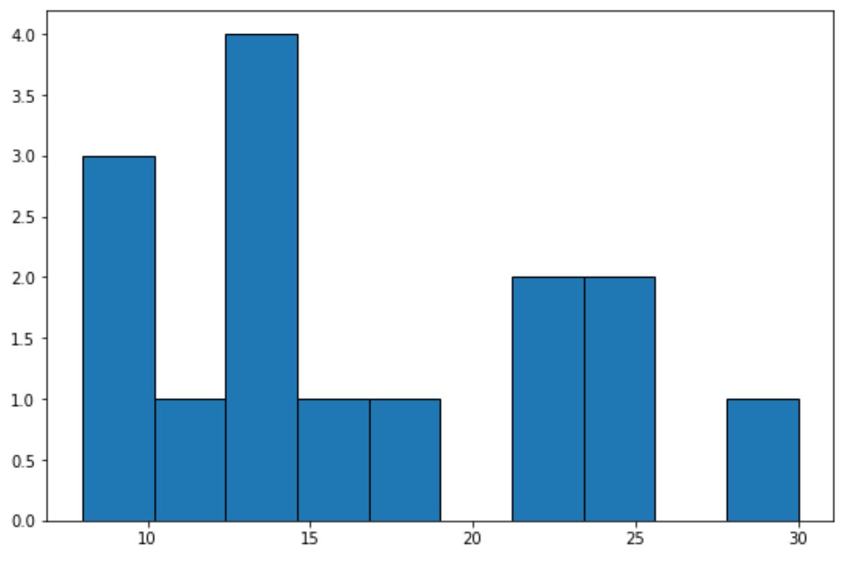
แกน x แสดงช่องสำหรับค่าข้อมูล และแกน y แสดงความถี่ของแต่ละช่อง
เราสามารถใช้โค้ดต่อไปนี้เพื่อแสดง ความถี่สัมพัทธ์ บนแกน y:
 import numpy as np
import matplotlib. pyplot as plt

#define data values
data = [8, 8, 9, 12, 13, 13, 14, 14, 15, 18, 22, 23, 24, 25, 30]

#create relative frequency histogram
fig = plt. figure ()
ax = fig. add_subplot (111)
ax. hist (data, edgecolor=' black ', weights=np. ones_like (data) / len (data))
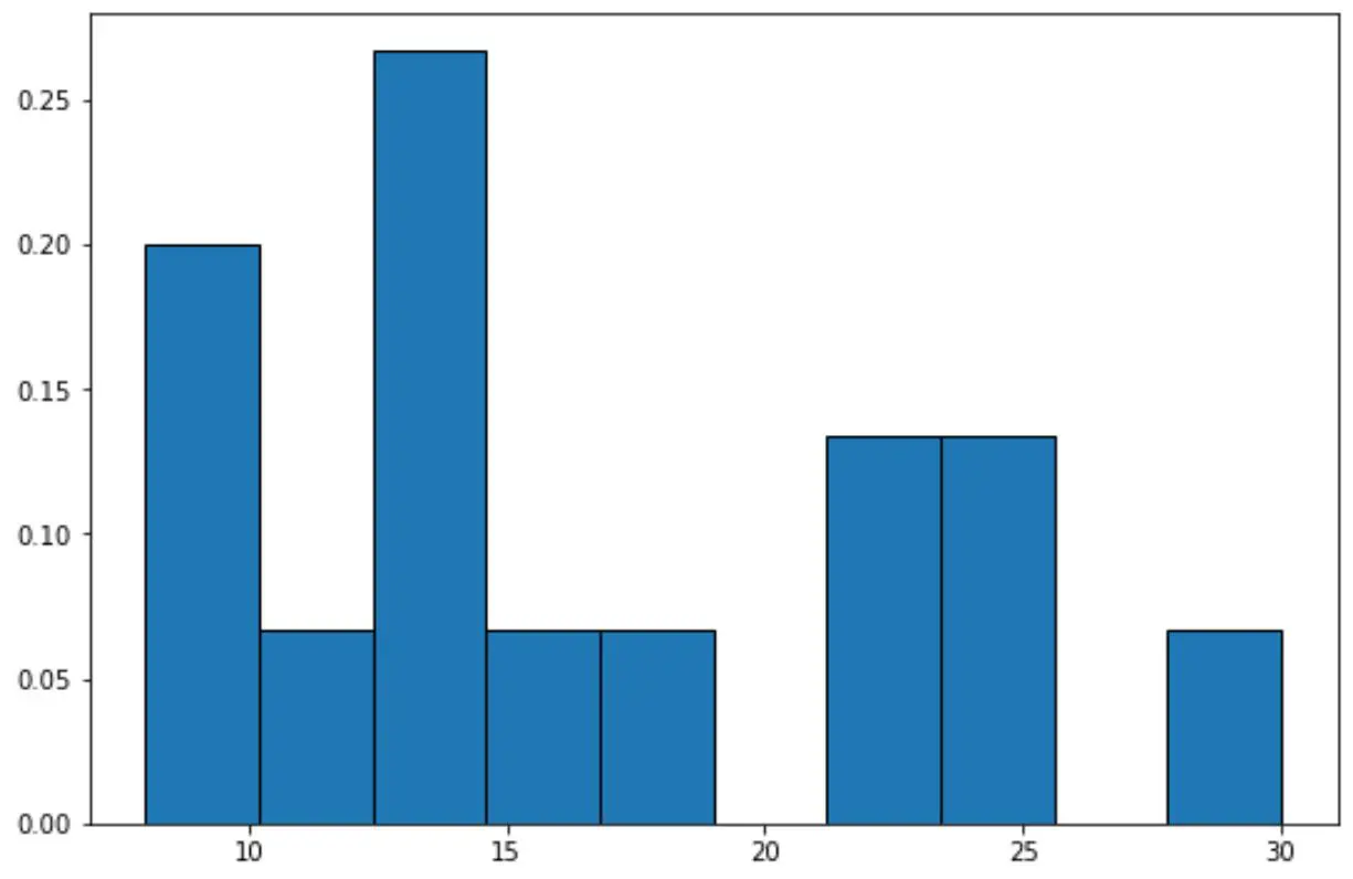
ตอนนี้แกน y จะแสดงความถี่สัมพัทธ์
เช่นในชุดข้อมูลจะมีค่าทั้งหมด 15 ค่า
ดังนั้น แทนที่จะแสดงความถี่ 4 บนแกน y สำหรับแท่งที่สูงที่สุดในกราฟ ตอนนี้แกน y จะแสดง 4/15 = 0.2667
นอกจากนี้เรายังสามารถใช้ฟังก์ชัน PercentFormatter() ของ Matplotlib เพื่อแสดงค่าบนแกน y เป็นเปอร์เซ็นต์:
import numpy as np
import matplotlib. pyplot as plt
from matplotlib. ticker import PercentFormatter

#define data values
data = [8, 8, 9, 12, 13, 13, 14, 14, 15, 18, 22, 23, 24, 25, 30]

#create relative frequency histogram with percentages on y-axis
fig = plt. figure ()
ax = fig. add_subplot (111)
ax. hist (data, edgecolor=' black ', weights=np. ones_like (data)* 100 / len (data))
ax. yaxis . set_major_formatter (PercentFormatter())
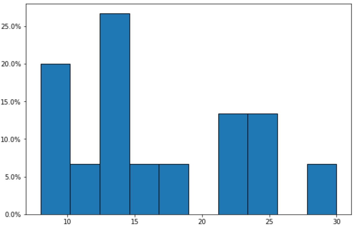
โปรดทราบว่าขณะนี้แกน y จะแสดงความถี่สัมพัทธ์เป็นเปอร์เซ็นต์
แหล่งข้อมูลเพิ่มเติม
บทช่วยสอนต่อไปนี้จะอธิบายวิธีสร้างกราฟทั่วไปอื่นๆ ใน Matplotlib:
วิธีเปลี่ยนสีของฮิสโตแกรม Matplotlib
วิธีปรับขนาดถังขยะในฮิสโตแกรม Matplotlib
วิธีสร้างฮิสโตแกรมจาก Pandas DataFrame
เกี่ยวกับผู้แต่ง
ดร.เบนจามิน แอนเดอร์สัน
สวัสดี ฉันชื่อเบนจามิน ศาสตราจารย์สถิติเกษียณอายุแล้ว และผันตัวมาเป็นครูสอนสถิติโดยเฉพาะ ด้วยประสบการณ์และความเชี่ยวชาญที่กว้างขวางในสาขาสถิติ ฉันกระตือรือร้นที่จะแบ่งปันความรู้ของฉันเพื่อเสริมศักยภาพนักเรียนผ่าน Statorials. รู้เพิ่มเติม