วิธีสร้างฮิสโตแกรมของตัวแปรสองตัวใน r
ฮิสโตแกรมเป็นวิธีที่มีประโยชน์ในการแสดงภาพการกระจายค่าของตัวแปรที่กำหนด
หากต้องการสร้างฮิสโตแกรมสำหรับตัวแปรใน R คุณสามารถใช้ฟังก์ชัน hist() และในการสร้างฮิสโตแกรมสำหรับตัวแปรสองตัวใน R คุณสามารถใช้ไวยากรณ์ต่อไปนี้:
 hist(variable1, col=' red ')
hist(variable2, col=' blue ', add= TRUE )
ตัวอย่างต่อไปนี้แสดงวิธีใช้ไวยากรณ์นี้ในทางปฏิบัติ
ตัวอย่าง: สร้างฮิสโตแกรมของสองตัวแปรใน R
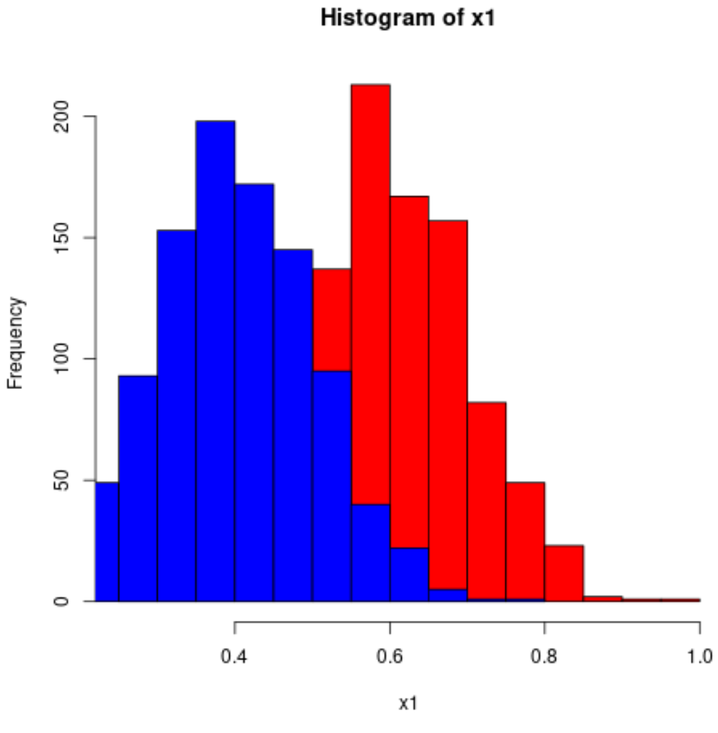
รหัสต่อไปนี้แสดงวิธีการสร้างฮิสโตแกรมของตัวแปรสองตัวใน R:
 #make this example reproducible
set. seeds (1)

#define data
x1 = rnorm(1000, mean=0.6, sd=0.1)
x2 = rnorm(1000, mean=0.4, sd=0.1)

#plot two histograms in same graph
hist(x1, col=' red ')
hist(x2, col=' blue ', add= TRUE )
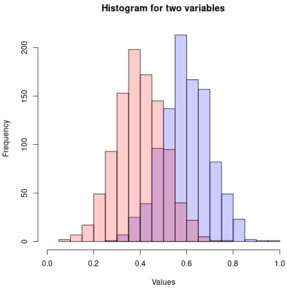
เนื่องจากค่าฮิสโตแกรมทับซ้อนกัน จึงเป็นความคิดที่ดีที่จะใช้สี rgb() โดยมีความโปร่งใสเพิ่มขึ้น:
 #make this example reproducible
set. seeds (1)

#define data
x1 = rnorm(1000, mean=0.6, sd=0.1)
x2 = rnorm(1000, mean=0.4, sd=0.1)

#plot two histograms in same graph
hist(x1, col=rgb(0,0,1,0.2), xlim=c(0, 1),
     xlab=' Values ', ylab=' Frequency ', main=' Histogram for two variables ')
hist(x2, col=rgb(1,0,0,0.2), add= TRUE )
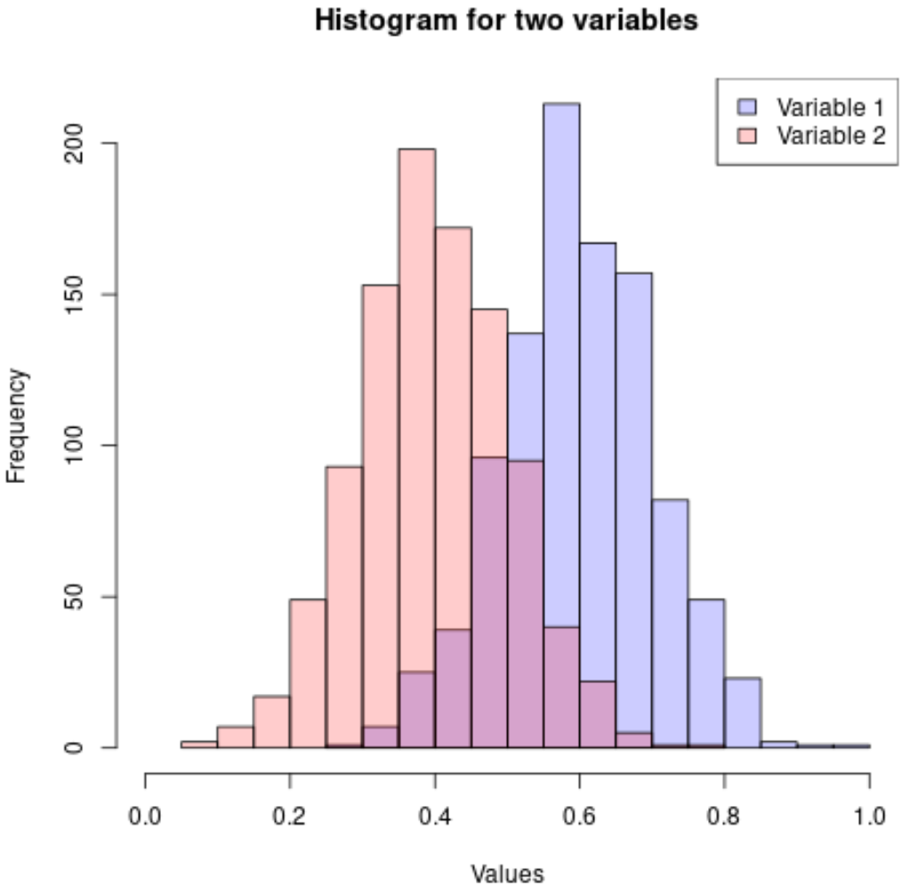
คุณยังสามารถเพิ่มคำอธิบายเพื่อทำให้ฮิสโตแกรมตีความได้ง่ายขึ้น:
 #make this example reproducible
set. seeds (1)

#define data
x1 = rnorm(1000, mean=0.6, sd=0.1)
x2 = rnorm(1000, mean=0.4, sd=0.1)

#plot two histograms in same graph
hist(x1, col=rgb(0,0,1,0.2), xlim=c(0, 1),
     xlab=' Values ', ylab=' Frequency ', main=' Histogram for two variables ')
hist(x2, col=rgb(1,0,0,0.2), add= TRUE )

#add legend
legend(' topright ', c(' Variable 1 ', ' Variable 2 '),
       fill=c(rgb(0,0,1,0.2), rgb(1,0,0,0.2)))
คุณสามารถค้นหาบทช่วยสอน R เพิ่มเติมได้ใน หน้านี้
เกี่ยวกับผู้แต่ง
ดร.เบนจามิน แอนเดอร์สัน
สวัสดี ฉันชื่อเบนจามิน ศาสตราจารย์สถิติเกษียณอายุแล้ว และผันตัวมาเป็นครูสอนสถิติโดยเฉพาะ ด้วยประสบการณ์และความเชี่ยวชาญที่กว้างขวางในสาขาสถิติ ฉันกระตือรือร้นที่จะแบ่งปันความรู้ของฉันเพื่อเสริมศักยภาพนักเรียนผ่าน Statorials. รู้เพิ่มเติม