วิธีสร้างแผนที่ความร้อนสหสัมพันธ์ใน r (พร้อมตัวอย่าง)
คุณสามารถใช้ไวยากรณ์พื้นฐานต่อไปนี้เพื่อสร้างแผนที่ความร้อนสหสัมพันธ์ใน R:
 #calculate correlation between each pairwise combination of variables
cor_df <- round(cor(df), 2)

#melt the data frame
melted_cormat <- melt(cor_df)

#create correlation heatmap
ggplot(data = melted_cormat, aes(x=Var1, y=Var2, fill=value)) +
  geom_tile() +
  geom_text(aes(Var2, Var1, label = value), size = 5 ) +
  scale_fill_gradient2(low = " blue ", high = " red ",
                       limit = c(-1,1), name=" Correlation ") +
  theme(axis. title . x = element_blank(),
        axis. title . y = element_blank(),
        panel. background = element_blank())
ตัวอย่างต่อไปนี้แสดงวิธีใช้ไวยากรณ์นี้ในทางปฏิบัติ
ตัวอย่าง: สร้างแผนที่ความร้อนสหสัมพันธ์ใน R
สมมติว่าเรามีกรอบข้อมูลต่อไปนี้ใน R ที่แสดงสถิติต่างๆ สำหรับผู้เล่นบาสเก็ตบอลแปดคน:
 #create data frame
df <- data. frame (points=c(22, 25, 30, 16, 14, 18, 29, 22),
                 assists=c(4, 4, 5, 7, 8, 6, 7, 12),
                 rebounds=c(10, 7, 7, 6, 8, 5, 4, 3),
                 blocks=c(12, 4, 4, 6, 5, 3, 8, 5))

#view data frame
df

  points assists rebounds blocks
1 22 4 10 12
2 25 4 7 4
3 30 5 7 4
4 16 7 6 6
5 14 8 8 5
6 18 6 5 3
7 29 7 4 8
8 22 12 3 5
สมมติว่าเราต้องการสร้างแผนที่ความร้อนสหสัมพันธ์เพื่อแสดงภาพ ค่าสัมประสิทธิ์สหสัมพันธ์ ระหว่างการรวมตัวแปรแต่ละคู่ในกรอบข้อมูล
ก่อนที่จะสร้างแผนที่ความร้อนสหสัมพันธ์ ก่อนอื่นเราต้องคำนวณค่าสัมประสิทธิ์สหสัมพันธ์ระหว่างตัวแปรแต่ละตัวโดยใช้ cor() จากนั้นแปลงผลลัพธ์ให้เป็นรูปแบบที่ใช้งานได้โดยใช้ฟังก์ชัน ละลาย () ของแพ็คเกจ reshape2 :
 library (reshape2)

#calculate correlation coefficients, rounded to 2 decimal places
cor_df <- round(cor(df), 2)

#melt the data frame
melted_cor <- melt(cor_df)

#view head of melted data frame
head(melted_cor)

      Var1 Var2 value
1 points points 1.00
2 assist points -0.27
3 rebound points -0.16
4 block points 0.10
5 assist points -0.27
6 assists assists 1.00
ต่อไป เราสามารถใช้ฟังก์ชัน geom_tile() จากแพ็คเกจ ggplot2 เพื่อสร้างแผนที่ความร้อนที่สัมพันธ์กัน:
 library (ggplot2)

#create correlation heatmap
ggplot(data = melted_cor, aes(x=Var1, y=Var2, fill=value)) +
  geom_tile() +
  geom_text(aes(Var2, Var1, label = value), size = 5 ) +
  scale_fill_gradient2(low = " blue ", high = " red ",
                       limit = c(-1,1), name=" Correlation ") +
  theme(axis. title . x = element_blank(),
        axis. title . y = element_blank(),
        panel. background = element_blank())
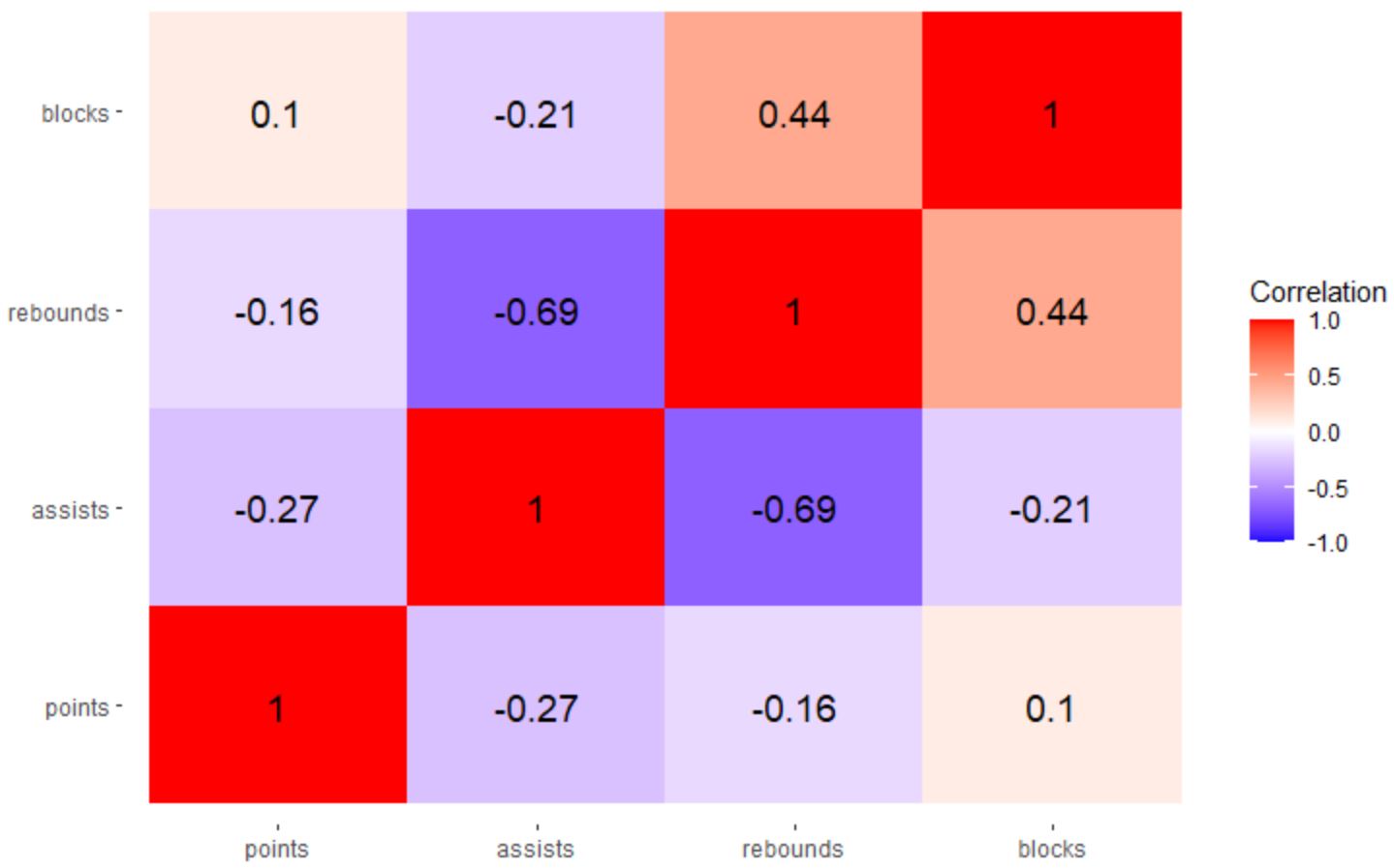
ผลลัพธ์ที่ได้คือแผนที่ความร้อนสหสัมพันธ์ที่ช่วยให้เราเห็นภาพค่าสัมประสิทธิ์สหสัมพันธ์ระหว่างการรวมตัวแปรแต่ละคู่ตามลำดับ
ในแผนที่ความร้อนนี้ ค่าสัมประสิทธิ์สหสัมพันธ์จะมีสีต่อไปนี้:
- สีน้ำเงิน หากปิดที่ -1
- สีขาว หากปิดเป็น 0
- สีแดง หากเข้าใกล้ 1
คุณสามารถใช้สีใดก็ได้ที่คุณต้องการสำหรับอาร์กิวเมนต์ ต่ำ และ สูง ในฟังก์ชัน scale_fill_gradient2()
ตัวอย่างเช่น คุณสามารถใช้ “สีแดง” สำหรับค่าต่ำ และ “สีเขียว” สำหรับค่าสูง:
 library (ggplot2)

#create correlation heatmap
ggplot(data = melted_cor, aes(x=Var1, y=Var2, fill=value)) +
  geom_tile() +
  geom_text(aes(Var2, Var1, label = value), size = 5 ) +
  scale_fill_gradient2(low = " red ", high = " green ",
                       limit = c(-1,1), name=" Correlation ") +
  theme(axis. title . x = element_blank(),
        axis. title . y = element_blank(),
        panel. background = element_blank())
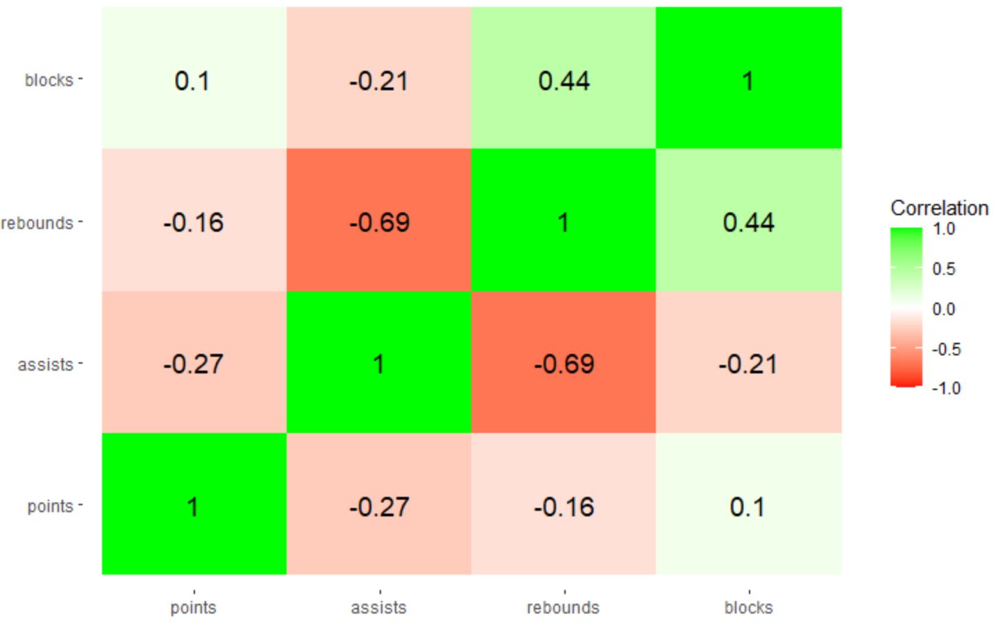
หมายเหตุ : คุณยังสามารถระบุรหัสสีเลขฐานสิบหกเพื่อใช้ได้ หากคุณต้องการควบคุมสีที่แน่นอนในแผนที่ความร้อนสหสัมพันธ์มากยิ่งขึ้น
แหล่งข้อมูลเพิ่มเติม
บทช่วยสอนต่อไปนี้จะอธิบายวิธีดำเนินการงานทั่วไปอื่นๆ ใน ggplot2:
วิธีหมุนป้ายกำกับแกนใน ggplot2
วิธีตั้งค่าตัวแบ่งแกนใน ggplot2
วิธีตั้งค่าขีดจำกัดแกนใน ggplot2
วิธีเปลี่ยนป้ายกำกับคำอธิบายใน ggplot2
เกี่ยวกับผู้แต่ง
ดร.เบนจามิน แอนเดอร์สัน
สวัสดี ฉันชื่อเบนจามิน ศาสตราจารย์สถิติเกษียณอายุแล้ว และผันตัวมาเป็นครูสอนสถิติโดยเฉพาะ ด้วยประสบการณ์และความเชี่ยวชาญที่กว้างขวางในสาขาสถิติ ฉันกระตือรือร้นที่จะแบ่งปันความรู้ของฉันเพื่อเสริมศักยภาพนักเรียนผ่าน Statorials. รู้เพิ่มเติม