
Comment tracer une distribution normale en Python : avec des exemples
Pour tracer une distribution normale en Python, vous pouvez utiliser la syntaxe suivante :
#x-axis ranges from -3 and 3 with .001 steps
x = np.arange(-3, 3, 0.001)

#plot normal distribution with mean 0 and standard deviation 1
plt.plot(x, norm.pdf(x, 0, 1))
Le tableau x définit la plage de l’axe des x et plt.plot() produit la courbe de la distribution normale avec la moyenne et l’écart type spécifiés.
Les exemples suivants montrent comment utiliser ces fonctions dans la pratique.
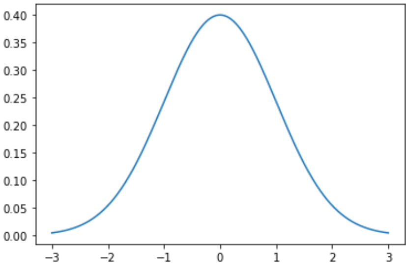
Exemple 1 : tracer une seule distribution normale
Le code suivant montre comment tracer une seule courbe de distribution normale avec une moyenne de 0 et un écart type de 1 :
import numpy as np
import matplotlib.pyplot as plt
from scipy.stats import norm

#x-axis ranges from -3 and 3 with .001 steps
x = np.arange(-3, 3, 0.001)

#plot normal distribution with mean 0 and standard deviation 1
plt.plot(x, norm.pdf(x, 0, 1))
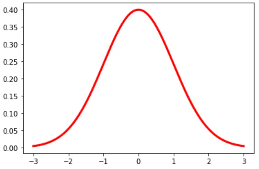
Vous pouvez également modifier la couleur et la largeur de la ligne dans le graphique :
plt.plot(x, norm.pdf(x, 0, 1), color='red', linewidth=3)
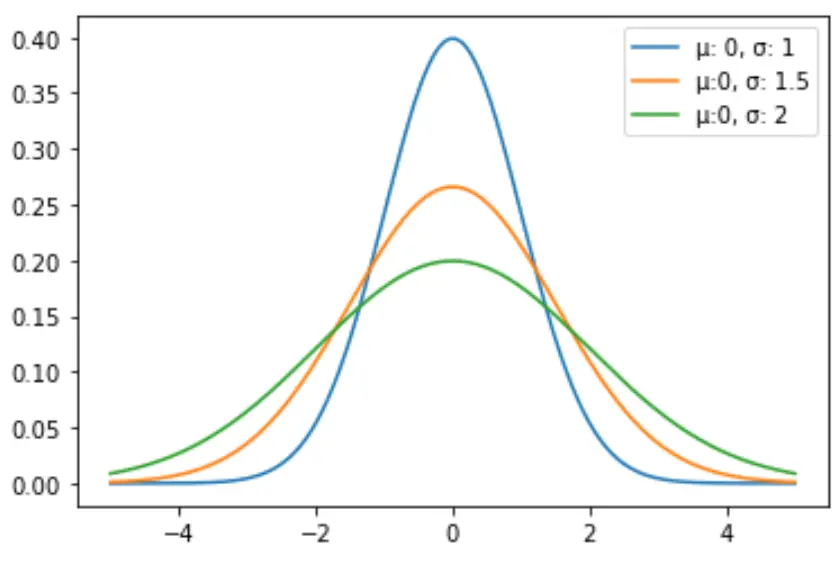
Exemple 2 : tracer plusieurs distributions normales
Le code suivant montre comment tracer plusieurs courbes de distribution normale avec différentes moyennes et écarts types :
import numpy as np
import matplotlib.pyplot as plt
from scipy.stats import norm

#x-axis ranges from -5 and 5 with .001 steps
x = np.arange(-5, 5, 0.001)

#define multiple normal distributions
plt.plot(x, norm.pdf(x, 0, 1), label='μ: 0, σ: 1')
plt.plot(x, norm.pdf(x, 0, 1.5), label='μ:0, σ: 1.5')
plt.plot(x, norm.pdf(x, 0, 2), label='μ:0, σ: 2')

#add legend to plot
plt.legend()
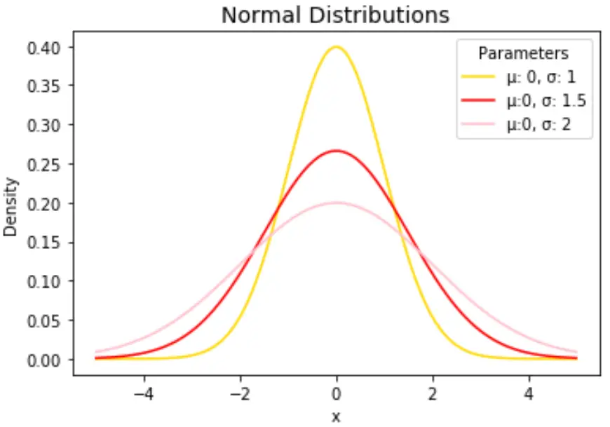
N’hésitez pas à modifier les couleurs des lignes et à ajouter un titre et des étiquettes d’axes pour compléter le graphique :
import numpy as np
import matplotlib.pyplot as plt
from scipy.stats import norm

#x-axis ranges from -5 and 5 with .001 steps
x = np.arange(-5, 5, 0.001)

#define multiple normal distributions
plt.plot(x, norm.pdf(x, 0, 1), label='μ: 0, σ: 1', color='gold')
plt.plot(x, norm.pdf(x, 0, 1.5), label='μ:0, σ: 1.5', color='red')
plt.plot(x, norm.pdf(x, 0, 2), label='μ:0, σ: 2', color='pink')

#add legend to plot
plt.legend(title='Parameters')

#add axes labels and a title
plt.ylabel('Density')
plt.xlabel('x')
plt.title('Normal Distributions', fontsize=14)
Reportez-vous à la documentation matplotlib pour une explication détaillée de la fonction plt.plot() .
à propos de l'auteur
Dr. Benjamin Anderson
Il est un professeur de statistiques à la retraite devenu éducateur dévoué sur Statorials. Avec une vaste expérience et une expertise dans le domaine des statistiques, je m'engage à partager mes connaissances pour responsabiliser les étudiants grâce à Statorials. Lire plus