
Comment tracer plusieurs lignes dans Matplotlib
Vous pouvez afficher plusieurs lignes dans un seul tracé Matplotlib en utilisant la syntaxe suivante :
import matplotlib.pyplot as plt

plt.plot(df['column1'])
plt.plot(df['column2'])
plt.plot(df['column3'])

...
plt.show()
Ce didacticiel fournit plusieurs exemples de la façon de tracer plusieurs lignes dans un graphique à l’aide du DataFrame pandas suivant :
import numpy as np
import pandas as pd

#make this example reproducible
np.random.seed(0)

#create dataset
period = np.arange(1, 101, 1)
leads = np.random.uniform(1, 50, 100)
prospects = np.random.uniform(40, 80, 100)
sales = 60 + 2*period + np.random.normal(loc=0, scale=.5*period, size=100)
df = pd.DataFrame({'period': period,
                   'leads': leads,
                   'prospects': prospects,
                   'sales': sales})

#view first 10 rows
df.head(10)


        period	    leads	prospects	    sales
0	1	27.891862	67.112661	62.563318
1	2	36.044279	50.800319	62.920068
2	3	30.535405	69.407761	64.278797
3	4	27.699276	78.487542	67.124360
4	5	21.759085	49.950126	68.754919
5	6	32.648812	63.046293	77.788596
6	7	22.441773	63.681677	77.322973
7	8	44.696877	62.890076	76.350205
8	9	48.219475	48.923265	72.485540
9	10	19.788634	78.109960	84.221815
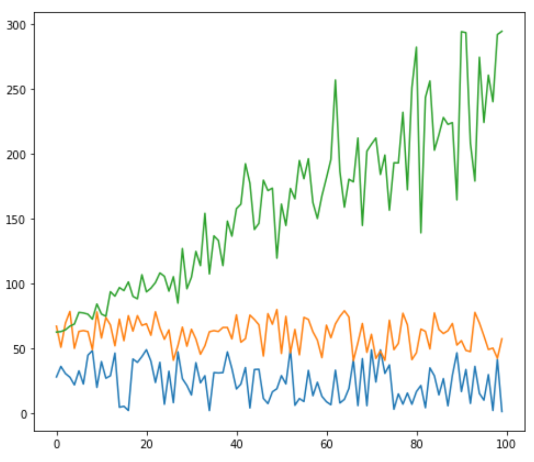
Tracer plusieurs lignes dans Matplotlib
Le code suivant montre comment tracer trois lignes individuelles dans un seul tracé dans matplotlib :
import matplotlib.pyplot as plt

#plot individual lines
plt.plot(df['leads'])
plt.plot(df['prospects'])
plt.plot(df['sales'])

#display plot
plt.show()
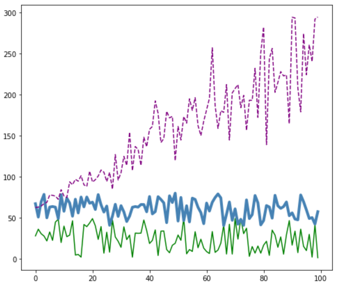
Personnaliser les lignes dans Matplotlib
Vous pouvez également personnaliser la couleur, le style et la largeur de chaque ligne :
#plot individual lines with custom colors, styles, and widths
plt.plot(df['leads'], color='green')
plt.plot(df['prospects'], color='steelblue', linewidth=4)
plt.plot(df['sales'], color='purple', linestyle='dashed')

#display plot
plt.show()
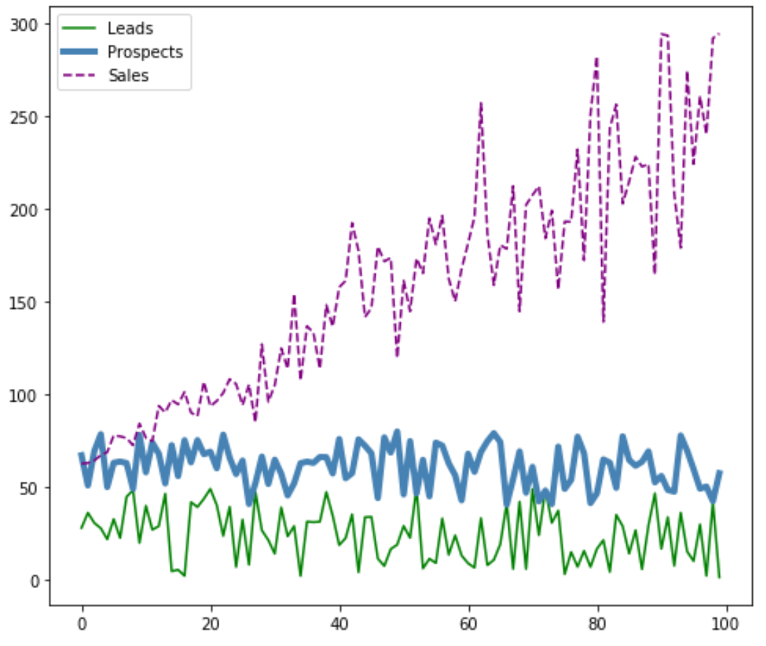
Ajouter une légende dans Matplotlib
Vous pouvez également ajouter une légende pour distinguer les lignes :
#plot individual lines with custom colors, styles, and widths
plt.plot(df['leads'], label='Leads', color='green')
plt.plot(df['prospects'], label='Prospects', color='steelblue', linewidth=4)
plt.plot(df['sales'], label='Sales', color='purple', linestyle='dashed')

#add legend
plt.legend()

#display plot
plt.show()
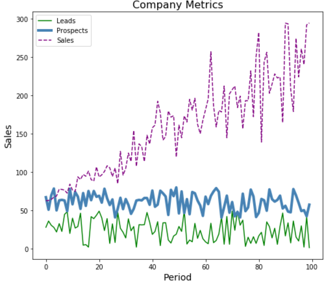
Ajouter des étiquettes et des titres d’axe dans Matplotlib
Enfin, vous pouvez ajouter des étiquettes d’axe et un titre pour compléter le tracé :
#plot individual lines with custom colors, styles, and widths
plt.plot(df['leads'], label='Leads', color='green')
plt.plot(df['prospects'], label='Prospects', color='steelblue', linewidth=4)
plt.plot(df['sales'], label='Sales', color='purple', linestyle='dashed')

#add legend
plt.legend()

#add axis labels and a title
plt.ylabel('Sales', fontsize=14)
plt.xlabel('Period', fontsize=14)
plt.title('Company Metrics', fontsize=16)

#display plot
plt.show()
Vous pouvez trouver plus de didacticiels Matplotlib ici .
à propos de l'auteur
Dr. Benjamin Anderson
Il est un professeur de statistiques à la retraite devenu éducateur dévoué sur Statorials. Avec une vaste expérience et une expertise dans le domaine des statistiques, je m'engage à partager mes connaissances pour responsabiliser les étudiants grâce à Statorials. Lire plus